- Active Investing - what is it?
- All Weather Trading Plan using Complex Theory (Parts 1 - 4)
- Asset Management (Parts 1 - 4)
- Back Testing
- Breaking out from consolidation
- Breakout trading in all market conditions
- Charting in a Nutshell
- Children of the Bear
- Fibonacci and the Golden Ratio
- Going Public
- Hull Moving Average
- MACD Breakout Trading (Parts 1 - 2)
- Making decisions with a Simple Moving Average
- Probability: do you have the stomach for it?
- Profit Taking
- Relative Strength
- Record Keeping
- Risky Business
- Short Selling
- Social Media Bubble
- Switching Gears
- Rate of Return indicator
- Time and Money
- Tools of the Trade
- Trade Warrants (Parts 1 - 4)
- Trading without spending money
- Trendlines
- Triangles
- GMMA's on Weekly Charts
- Writing Custom Indicators
Articles include:
This article is designed to help you achieve a better understanding of some of the more popular indicators and tactics used by today's Traders by taking an in-depth look at how they are constructed and why. It will include working examples showing the correct application and incorrect application of 'Price/Volume' breakout searches, 'Rate of Return' searches, the MACD Indicator and the Range Indicator.
Ease of Use
Prior to the use of PCs a chartist would use pencil, ruler and graph paper to create price charts. One of the earliest indicators in use was the crossover indicator created by overlaying a fast moving average with a slow moving average, pictured below.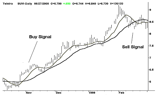
By today's standards this indicator is considered simplistic where half a century ago it would have taken hours of tedious calculations and careful construction. Charting software has relieved us of this burden but an all too common by-product of 'Ease of use' is a lack of understanding of many modern indicators and trading tactics and their proper application.
- Typical misconceptions of popular indicators and tactics are:
- The MACD indicator being incorrectly described as 'An average of an average'.
- The MACD indicator used as a trend following tool
- 'Price/Volume Breakout' searches used as buying signals
- To master any indicator or tactic a Trader must have an appreciation of the following:
- Indicator design and construction
- An indicator's strengths and weaknesses
- Correct and incorrect applications
'Price/Volume Breakout' Searches
I am actually a second generation Share Trader and my father was doing in the 1960's what is commonly referred to as a Price/Volume breakout search. In those days they used the trading summary printed in the daily newspapers and cross-correlated shares that were on the 'Best Performers' list with shares that were on the 'Highest Turnover' list. Shares that appeared on both lists were enjoying positive sentiment and warranted a closer look. Today the modern Trader uses charting software to locate these same potential trading candidates.Daily and Weekly Searches
'Price/Volume Breakout' searches can be performed on either a daily or weekly basis where the choice is entirely dependent on a Traders preferred timeframe. The following chart shows a sharply rising share price accompanied by a sharp rise in volume. Imagine if you owned a widget store and you raised the price of widgets by 10% and then sales increased by 100%. Retailers would say this is highly unlikely but it is a regular occurrence in the Stockmarket.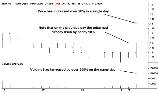
The above chart pattern indicates positive market sentiment and is commonly referred to as a 'Price/Volume Breakout'. Charting programs can locate this type of pattern using automated search routines that will save the trader hours of manual scanning.
Although charting programs have this search capability; it is left to the user to set the criteria for the search. But in addition to searching for sharp increases in both price and volume, it is also necessary to filter out shares that move rapidly because of low liquidity. In other words we don't want to detect a 1-cent share that has jumped to 2 cents in value because of several relatively small purchases. This is done by checking 'Money Flow' which is calculated by multiplying the volume by the median price of the same period, ie. Volume x [(high+low)/2].
The following search criteria should return a handful of trading opportunities for each trading period. But as market conditions change over time, the search criteria should be adjusted accordingly. The following settings can be used for both daily and weekly searches. Weekly searches should be done at the end of the week, ie. after Fridays close. Of course it is highly unlikely that the following criteria will pickup any Blue Chip shares. Which is a good thing because 'Price/Volume Breakout' searches are designed to pickup only speculative shares.
- Price increase of 10% or more over the previous days closing price.
- Volume increase of 100% or more over the previous 10 day average.
- Daily Money-Flow of $250,000 (Weekly Money-Flow of $500,000)
The following chart shows a 'Price/Volume Breakout' Indicator triggering an alert when price activity increases by at least 15% in a single day. (Note the horizontal bar set at 15)
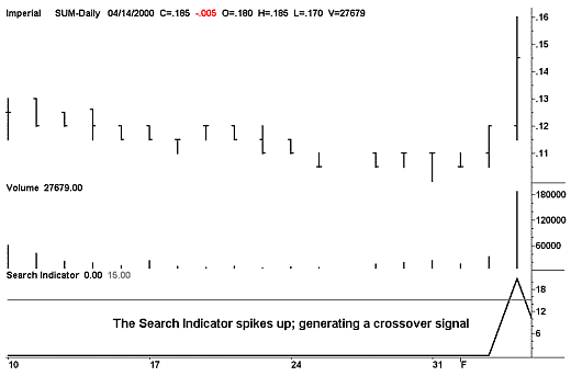
If the criteria are set lower then a larger number of possibilities will be found and less possibilities if the criteria are set higher. After conducting a daily or weekly search the trader will have a short list of possibilities that must be examined individually.
| Search formulas for Metastock - (Volume units must be given in 100s) | |
| colA = VOLUME*CLOSE | colC = Mov(Ref(VOLUME,-1),10,S) |
| colB = VOLUME/2 | colD = Ref(CLOSE,-1)*1.1 |
| Filter = colA>2500 AND colB>colC AND CLOSE>colD | |
Analysing Search results
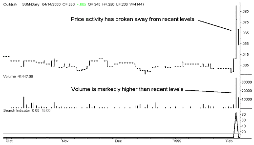
Exchange traded derivatives such as warrants, company issued options and partly paid shares will trigger search indicators and should be ignored. These financial products track the price of the underlying share with increased volatility. Technical analysis is always applied to the parent share and the derivative product is traded for increased leverage.The trader needs to 'Eyeball' each chart to see whether the search indicator has detected fresh sentiment or another effect such as a recovery from a recent low. Recovery spikes resemble price/volume breakouts but are the result of bargain hunters buying on price lows.
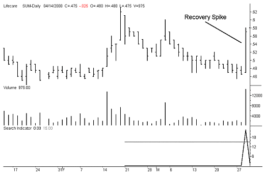
In the above chart the search indicator has found a recovery spike rather than fresh sentiment. The price has bounced back from a low but remains in a price congestion area. Note that the level of volume is no higher than previous levels. This suggests that no new buyers have joined the market. The following chart shows positive sentiment...what we're searching for.
Entry Signal
Posmedia (shown below) has good liquidity and a share price that is beginning to trend up from its recent low at 17.5 cents. It is a potential trading opportunity that was picked up by a 'Price/Volume Breakout' search. But remember never to use a 'Price/Volume Breakout' indicator as a 'Buy Indicator'. Profit takers usually show up the day after a 'Price/Volume Breakout' has occurred. Note in the following chart how the market opens higher the next day but closes down on the previous day as the bears take control of the market.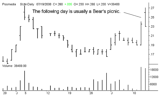
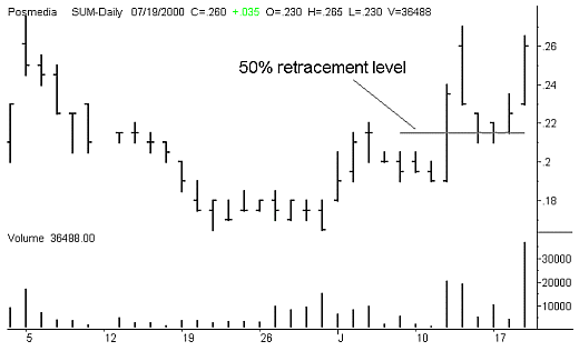
On the balance of probability it pays to anticipate the retracement. The following chart shows how the price retraced to the 50% retracement level and found support. It then began to rise, signaling an entry. The following chart also clearly depicts the developing trend in Posmedia.
If 'Price/Volume Breakout' searches aren't designed to pickup Blue Chip shares then we need to employ a different tool to point us in the direction of profitable trading opportunities in the top end of the Stockmarket. The 'Rate of Return' indicator is such a tool. It returns the annual rate of return of a share given its current rate of climb and its current share price. It achieves this by calculating the annual return and dividing it by the current share price. The result is then multiplied by 100 to convert it to a percentage.
- Example
- Lets assume that a share is climbing at a rate of $2 per year.
- The current price of the share is $5.
- The annual 'Rate of Return' would be 0.4 ($2 divided by $5).
- Converting this to a percentage we get 0.4 x 100 = 40%.
Therefore, based on its current trend & current share price, the annual rate of return is 40%.
The 'Rate of Return' Indicator
The Rate of Return indicator performs its calculations using a computer-generated line of linear regression. The following chart of Lang Corporation shows a line of linear regression that is generated using 1 year of price activity. In other words it is a line of best fit over the past year.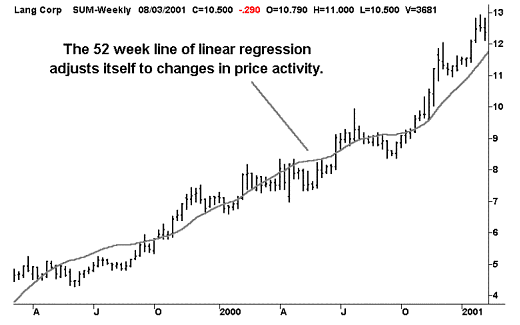
We can measure the change in price over any given period of a 52-week line of linear regression, which is indicative of the overall trend, to calculate the annual rate of return.
- Example
- Value of the 52 week line of Linear Regression today = 11.67
- Value of the 52 week line of Linear Regression 6 Months ago = 9.06
- Current share price = 12.37
- Rate of return over the past 6 Months = (11.67 - 9.06) ÷ 12.37 = 0.21
- Annualize and convert to a percentage = 0.21 x 2 x 100 = 42%
In the above example we have taken the change in price over a 6-month period and then multiplied the answer by 2 to determine the annual rate of return. By taking a 6-month 'Snapshot' of the change in price instead of using the change in price over the past year, we have made the rate of return indicator more responsive, ie. the shorter the period under examination; the more responsive the indicator is. The 'Rate of return' indicator is shown at the bottom of the following chart. It employs the mathematical approach described above.
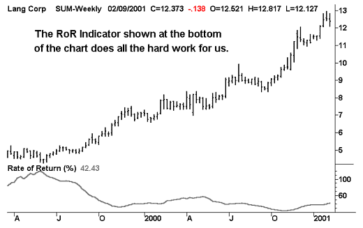
The RoR indicator is returning a figure of 42.43%, which coincides with our manual calculations. Although we can achieve different results by sampling the change in price over different periods, it is only imperative that we adhere to our original concept of rate of return and that we are consistent in our approach. We are interested in comparing different trends rather than trying to come up with a perfect method that gives us an absolute set of results.
The MetaStock formula for the RoR indicator is:
Weekly Charts 200*(LinearReg(C,52)-Ref(LinearReg(C,52),-26))/C
This formula is designed to return annualized results when applied to weekly charts. As it is designed to locate established long term trends it is typically only used on weekly charts.
Performing 'Rate of Return' Searches
Price/volume breakout searches point us in the direction of 'Hot Stocks' and are an invaluable tool when it comes to speculative share trading. But they will not identify large capitalization Blue Chip shares that are trending up gradually over time. The elephants of the Stockmarket such as BHP-Billiton don't jump 10% in price and 100% in volume in a single trading period.Blue Chip shares are ponderous in nature and we need to employ a totally different method of identifying potential trading opportunities within this fraternity of large capitalisation shares. Rate of return searches gives us the ability to filter out shares that are trending up over time and then compare their profitability. The RoR indicator shown in the following chart has a horizontal line positioned at 25% which can be used as a cutoff level.
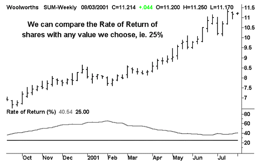
Woolworth's, pictured above, is currently rising at a rate of 40.54% per annum and would be picked up by a rate of return search with a cutoff level of 25%. Unlike price/volume breakout searches where we would scan the entire market, rate of return searches are only applied to pre-selected Blue Chip shares of interest such as the S&P/ASX200 Index shares for example. In the case of 'Active Investing', a Blue Chip share trading strategy, we only scan shares that have a capitalization of at least $100 Million and are fundamentally sound.
The key factor for employing market searches successfully is to always work from a foundation of need. Success is defined as the ability to take profits from the market and taking profits from the market depends on our ability to interpret price activity, not our ability to use computers nor the price we pay for our software. Computers are a 'Tool of the Trade' and are there to solve our problems and meet our needs. They are a means to an end... not an end within themselves.
Analysing Search results
As with 'Price/Volume Breakout' searches, 'Rate of Return' searches can also pickup garbage.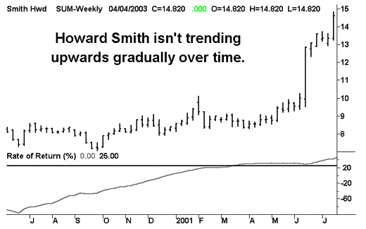
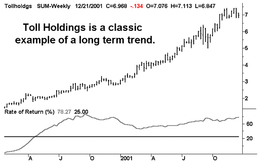
We are definitely not looking for shares that jump up like Howard Smith did when news of a takeover bid was released. We are looking for long-term trends such as Toll Holdings below.
MACD stands for 'Moving Average Convergence Divergence' and works by measuring the difference between a fast and a slow exponential moving average. It is probably the most popular indicator in use throughout the world today and also the most misunderstood. The three components that make up the MACD Indicator are constructed in the following way.
- Signal Line = 12 Day EMA - 26 Day EMA
- Reference Line = 9 Period EMA of the Signal Line
- Histogram = Signal Line - Reference Line
(The values used in these definitions are the default values from Supercharts and Metastock)
Common Interpretation
A buy signal is generated when the signal line crosses upwards through the reference line and a sell signal is generated when the signal line crosses downwards through the reference line. The histogram indicates the strength of the underlying trend. The following chart of Telstra shows a very clearly defined set of entry and exit points. Unfortunately such unambiguous trading signals are not such a common occurrence when trading with the MACD Indicator.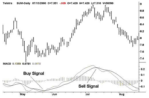
The Designer of the MACD Indicator, Gerald Appel, claims that the MACD works better in a rising market than a falling market. It is also universally accepted that a buy signal is more reliable if the crossover occurs below the histogram and similarly for a sell signal that occurs above the histogram.
MACD - Wrong Application
The MACD indicator cannot be used to monitor a trend for an exit signal. This is because the reference line is an average of the signal line and it will collapse into the signal line under constant trending conditions, causing whipsaws. This occurs when the value of the signal line remains constant for any length of time, ie. the 12 day EMA - 26 day EMA = a constant.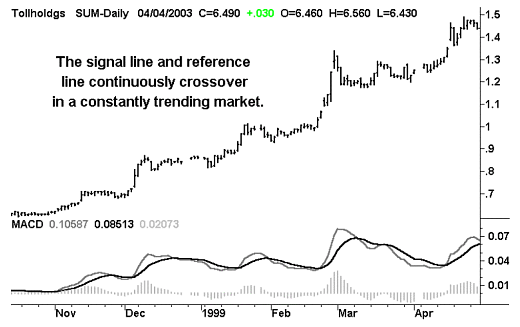
MACD - Correct Application
Having located a point of agreement with the use of Daryl Guppy's MMAs, the MACD is used to detect the direction and timing of an anticipated breakout and, hence, an entry signal.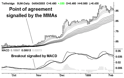
The MACD as a Momentum Oscillator
The histogram component of the MACD indicator can also be employed as a momentum oscillator. The signal line of the MACD measures the distance between the 12-day EMA and the 26-day EMA by subtracting one from the other. The distance between these averages will fluctuate in sympathy with any change in the direction of price activity. The signal line is in fact amplifying any changes in the direction of price activity as shown in the following chart.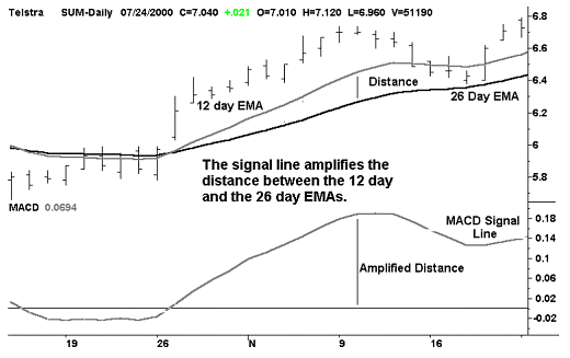
The reference line is a 9-day EMA of the signal line and, as such, is designed to lag behind the signal line. This lagging effect generates crossovers whenever there is any change in the direction of price activity. The MACD Histogram takes the whole process a step further by amplifying the difference between the signal line and the reference line. In doing so, it is measuring the change in the rate of change of price activity... which is in fact momentum.
It can be employed as a momentum oscillator by dividing it by the 26 day EMA to normalize it over time. This is a necessary step because the MACD Histogram, unlike most other momentum oscillators, is directly linked to price and as such has an unwanted tendency to increase in magnitude with any overall increase in price. The MACD Histogram Momentum Oscillator generates a less volatile but somewhat more responsive curve than its conventional and better known cousins, the RSI and Slow-Stochastic oscillators.
The MetaStock formula for the MACD Histogram Momentum Oscillator is:
((Mov(CLOSE,12,E)-Mov(CLOSE,26,E)) -Mov(Mov(CLOSE,12,E) -Mov(CLOSE,26,E),9,E))/Mov(CLOSE,26,E)
Most charting programs will allow users to overlay indicators with support/resistance lines.
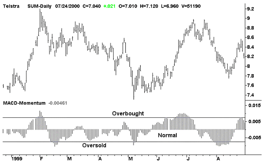
These lines can be positioned over the MACD histogram momentum oscillator to create overbought and oversold zones. There are no set rules or values for creating these zones and they can be adjusted to suit the behaviour of each individual share as shown in the following chart of Telstra. Note that the scale of the MACD oscillator is of no importance and its magnitude will vary dramatically from share to share.
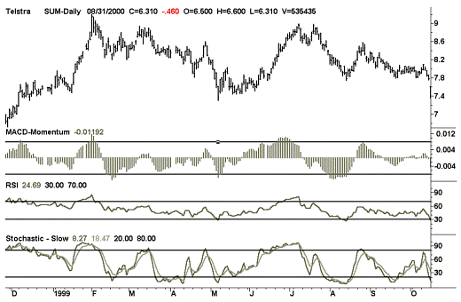
The following chart compares the MACD oscillator to the RSI and stochastic oscillators.
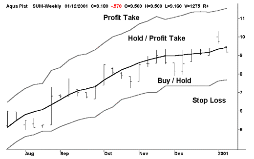
The range indicator provides us with a series of price ranges that tell us when to buy, sell, hold or profit take. It is a trade management tool specifically designed for use in trending markets, unlike the MACD. Its purpose is to eliminate indecision when entering and exiting trades and streamline the process of monitoring open positions... also unlike the MACD.
Many charting programs will generate a line of linear regression for any given period in much the same manner as a moving average. The central line (black) in the following chart is a line of linear regression, which is based on a moving period of 13-weeks. This line passes through the heart of price activity and, with the help of two other upper and lower lines (grey), defines four distinct zones as illustrated by the following chart of Aquarius Platinum.
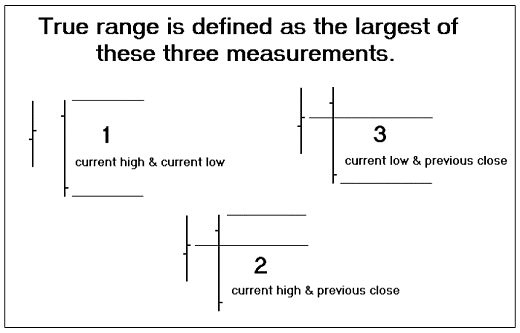
The upper and lower lines are based on the volatility of price behaviour and they create an envelope that defines our tolerance towards price activity. J. Welles Wilder developed the concept of 'true range', which defines the volatility of price activity, taking into account both the price range during any given trading period and price movements between trading periods. He defined 'true range' as being the largest of three distinct measurements.
- The difference between the highest price and the lowest price of the current trading period.
- The difference between the highest price of the current trading period and the closing price of the previous trading period.
- The difference between the lowest price of the current trading period and the closing price of the previous trading period.
Looking at these three measurements on a chart will promote a better understanding of them.
True range is based on the two most recent trading periods and is of little use to us if we are trying to measure price volatility over a longer period of time. We have to calculate the 'average true range' in order for us to put 'True range' to practical use. Since our line of linear regression is based on 13 weeks, then we should be consistent and use the same period for calculating the average true range. The chart of Aquarius Platinum has an upper line which is displaced by 3 times the 13-week average true range and a lower line which is displaced by 2.5 times the 13-week average true range. The reason for displacing the upper line by a slightly larger proportion than the lower line is that the line of linear regression tends to lag behind the most recent price activity and in an upward trend this causes it to be displaced slightly downwards.
Looking back at the chart of Aquarius again you will notice that the lower line has a series of flat spots. This is because it is allowed to rise with the progression of an upward trend but it is never permitted to retreat. It is in essence our stop loss price and one of the golden rules of trading is to, 'Never widen your stop loss'. The range indicator removes indecision by providing traders with a clear set of unambiguous trading signals and can be applied to either daily or weekly charts. The MetaStock formulae for the range indicator is:
- Central Line
- LinearReg(C,13);
- Lower Line
- If(LinearReg(C,13)>PREV,If(LinearReg(C,13)-(ATR(13)*2.5)>PREV,LinearReg(C,13)-(ATR(13)*2.5),PREV),LinearReg(C,13));
- Upper Line
- LinearReg(C,13)+(ATR(13)*3);
MetaStock in a Nutshell by Wrightbooks contains detailed information on building custom indicators using Metastock and it explains the range indicator's construction in detail. Simon Sherwood, the author of Metastock in a Nutshell, is also the author of the above formulas.
Trading Rules
A Trader's actions will depend solely upon which zone price activity is in. Although the construction of this indicator incorporates some rocket science, it virtually removes the need for Share Traders to make any discretionary decisions... providing we have a clear and unambiguous set of rules to work with.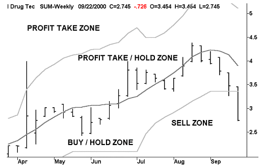
| A typical set of rules for the 4 zones would be: | |
| Sell Zone | Sell if price activity closes at the end of the trading period in this zone. This is the single most important rule and must be totally unambiguous. |
| Buy/Hold Zone | Buy the share if it has closed at the end of the trading period in this zone. The share must be purchased at a price between the lower deviation and the central cord. Hold if already owned. |
| Profit Take/Hold Zone | Hold if the share price is in this zone or elect to take profits. |
| Profit Take Zone | Take profits if the share price closes at the end of the trading period in this zone. The reason for having a mandatory profit take zone is because most people, including Share Traders, are greedy and we want our trading tools to overcome human weaknesses such as greed and fear. |
A trading strategy is a set of rules. If there is a problem with our trading rules then we can always change them. But to trade without a set of rules is gambling rather than trading.